Product Perspective
Case Study

Fintech Wallet App

A secure, intuitive wallet app that supports UPI payments, lets users split expenses with friends, and gives clear visibility into personal spending.

Duration: 3 Weeks    Tools: Figma, Lucid, Adobe Photoshop
The Requirement

What Users & the Business Needed

  • Seamless UPI payments
  • Split group expenses from past transactions
  • Real-time wallet balance and recent transactions
  • Easy linking and management of bank accounts (card/UPI)
  • Filterable spend analytics (day, week, month, year)
  • Persistent footer navigation for ease of use
  • Secure onboarding with mobile/email OTP verification
The Solution

Dashboard-First UX + Smart Split System

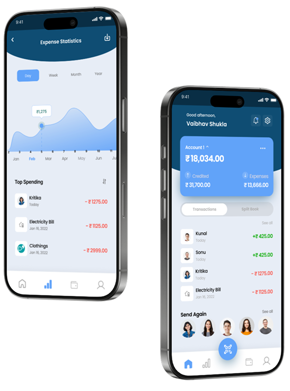
  • Uses a split book toggle to switch between personal and shared expenses
  • Allows one-tap conversion of any transaction into a split
  • Provides visual spend tracking and category insights
  • Keeps wallet/account management simple and secure
  • Offers bottom nav access to all key sections: Home, Stats, UPI, Wallet, Profile
Thought Process

Product Thinking & Strategy

  • Found a market gap: Expense-splitting is usually done outside of wallet apps
  • Defined a lean MVP: Prioritized features that deliver maximum user value
  • Focused on trust: Designed secure onboarding and account linking
  • Created tight feedback loops: Especially after split/payment actions
  • Planned for scalability: Set a clear roadmap for rewards, budgets & more
The Process
Research
Opportunity
Strategy
Delivery
Feedback
Research

Building for Real Financial Behavior

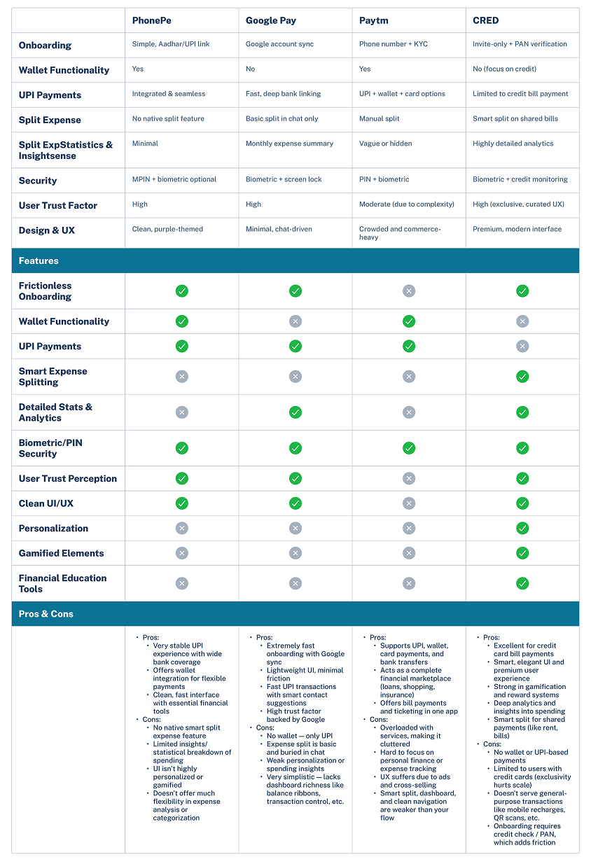
Key Insights from Competitive Analysis:
  • Users dislike cluttered interfaces (e.g., Paytm) and crave focused tools.
  • Most UPI apps (like GPay, PhonePe) don't offer expense splitting or breakdowns.
  • Users have little visibility into their spending patterns or shared group expenses.
  • Users hesitate to link bank accounts or cards to unknown apps — UI and flow must establish credibility.
User Motivations Identified:
  • Track and split expenses with friends, roommates, and colleagues.
  • Manage wallet balance and bank accounts from one place
  • Access clean, personalized financial insights
  • Execute fast, secure UPI and card payments with minimal steps
Research
Opportunity

Clarifying the Problem & the User

Problem Statement:

Users need a clean and secure platform to manage digital payments, track expenses, and split costs with others — all without switching between apps.

  • Deliver a dashboard-first experience with wallet balance, stats, and actions front-and-center
  • Simplify split expense creation — turn past transactions into group costs in one tap
  • Offer a clear stats and analytics section with day/week/month filters
  • Design secure, intuitive onboarding and bank linking
  • Ensure every screen reinforces trust, clarity, and minimalism
Opportunity
UX Strategy

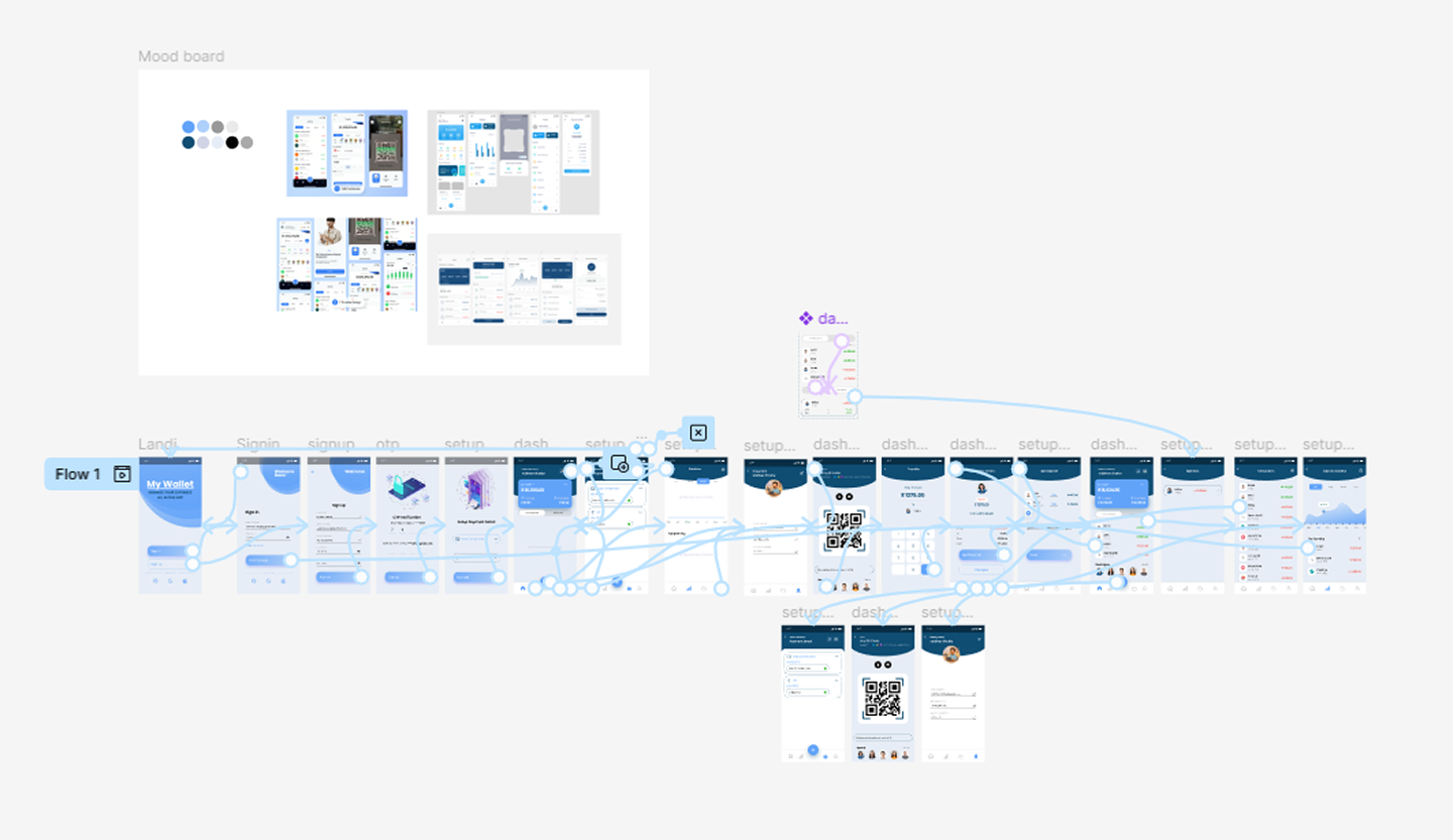
Mapping User Flow and Core Features

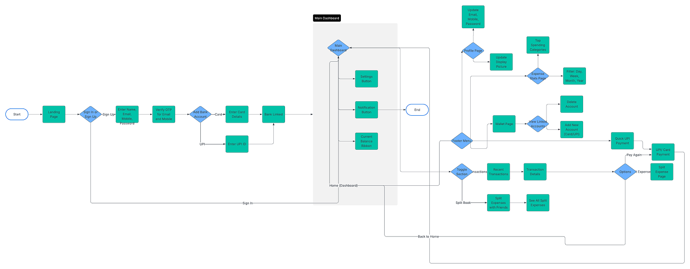
  • Smooth sign-up with OTP, secure card/UPI linking
  • Displays wallet balance, recent activity, and switch between "Transactions" and "Split Book"
  • Convert any transaction into a split or repeat a payment
  • Filterable expense summary with "Top Spends"
  • Add/delete bank accounts and cards securely
  • Update personal info, security credentials
  • UPI payments, dashboard, expense split, bank linking, stats
  • Transaction filters, secure PIN setup, QR scanner
Strategy
Delivery

From Concepts to Interfaces

With clarity on the structure, we began shaping the visual identity and interaction design.

Moodboard:
  • Inspired by the clarity of Google Pay and the premium tone of CRED
  • Color palette: Dark & light themes with accent colors for trust (blue, green)
  • Typeface: Poppins for readability and friendliness
Low-Fidelity Wireframes:
  • Sketched initial layout for each core screen (dashboard, onboarding, split flow, stats)
  • Focused on information hierarchy and action prominence
High-Fidelity Designs:
  • Designed fully responsive screens for mobile
  • Interactive prototype built in Figma, optimized for usability tests
  • Clean UI with bottom tab bar for quick access: Home, Stats, Wallet, Profile
Delivery
Feedback

Validating with Real Users

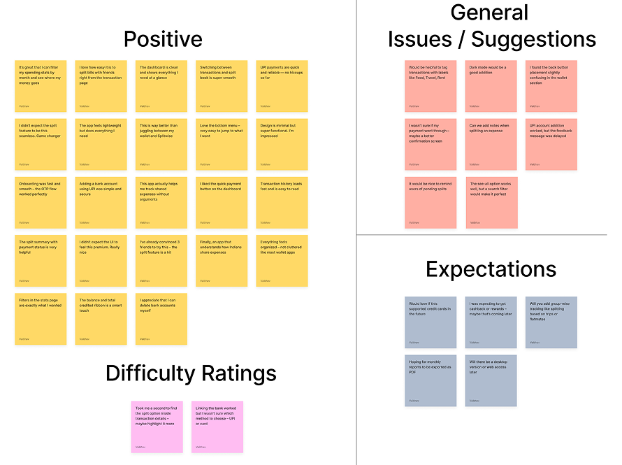
What Worked:
  • Inspired by the clarity of Google Pay and the premium tone of CRED
  • Color palette: Dark & light themes with accent colors for trust (blue, green)
  • Typeface: Poppins for readability and friendliness
A/B Testing:
  • Compared dashboard layouts: ribbon-style vs. tabbed — ribbon won for clarity
  • Evaluated "Add Account" via modal vs. full page — full page had higher completion
Feedback
Reflection

What I Learned as a Product Manager

The development of this fintech wallet application was a highly iterative and user-driven journey. From the outset, the goal was to solve a real user pain point — managing personal and shared expenses seamlessly while keeping the interface clean and intuitive. Through competitor analysis, we identified gaps in existing apps around split expenses, transparency of transactions, and unified dashboards.

During testing, users responded positively to the simplicity of the dashboard, the quick payment feature, and the way split transactions were handled. These validations were crucial in shaping the final direction of the product. On the flip side, feedback around expectations like cashback, group-wise tracking, and minor UI confusions helped us prioritize future enhancements.

As a product owner, it was important to constantly balance between delivering core value quickly and planning scalable improvements for upcoming iterations. By staying close to the user needs, validating assumptions through feedback, and focusing on clear use-case flows, we were able to ship a product that feels both practical and delightful.

The experience reinforced the value of listening actively, validating continuously, and designing with empathy — the foundation of any successful product.